
As we enter our 25th year and continue our mission of empowering resilience and potential in the children of first responders, we are proud to introduce a refreshed look for our organization — one that more fully reflects the heart of who we are and the future we are building together.
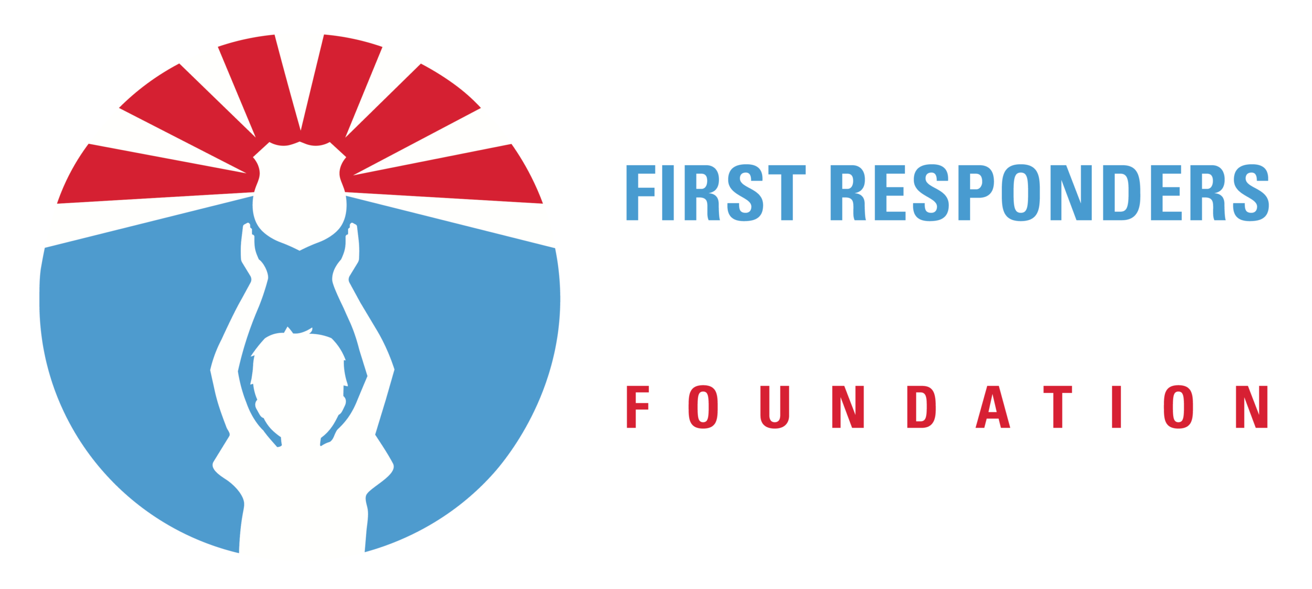
Our new brand identity centers on the children we serve. The updated logo symbolizes strength, resilience, and enduring pride. At its heart, a child raises a badge high — honoring the sacrifice and service of first responders while representing the next generation carrying that legacy forward with courage and hope.
Every element of the design was created with purpose. The badge stands as a timeless symbol of duty, protection, and bravery. The radiating lines reflect the far-reaching impact first responders have on families and communities across generations. The circular composition conveys unity, stability, and support — the very foundation of our work.
While our look has evolved, our purpose remains unchanged: to ensure children of first responders have the encouragement, opportunities, and support they need to grow, thrive, and achieve their dreams.
This new chapter reflects not only who we are today, but the future we envision — a future where every community uplifts children of first responders and recognizes the unique burdens and sacrifices they carry every day.
Thank you for being part of this journey with us.
Jillian Crane
Chief Executive Officer